Jacobsen
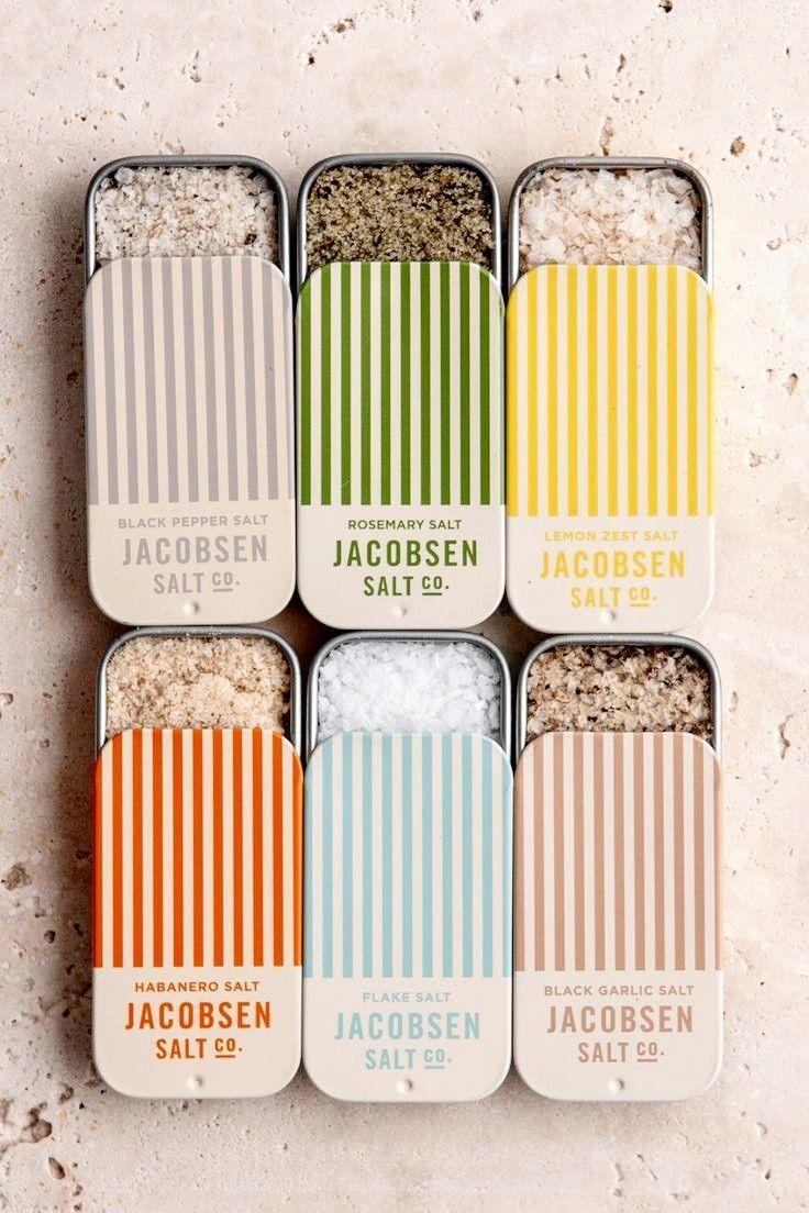
Jacobsen is an artisanal sea salt brand that elevates a foundational ingredient into an exceptional product. It reveals origin, texture, crystallization, and harvesting methods through an approach inspired by Nordic traditions and raw maritime landscapes. Positioned as premium, it targets chefs, specialty stores, and culinary enthusiasts. The visual world is minimalist and precise: restrained palette, natural materials, bold typography. Jacobsen turns a universal staple into a culinary signature.
PROBLÉMATIQUE
Salt is one of the most commoditized food products: interchangeable, poorly differentiated, and low in perceived value. Building a strong brand around such a simple ingredient is a major strategic challenge. How do you create desirability for a product seen as basic? Justify premium positioning against industrial giants? Tell an authentic story without overplaying “artisan” clichés? And appeal to both demanding professionals and quality-seeking consumers?
NOTRE RÉPONSE
We positioned Jacobsen around a central concept: the nobility of simplicity. Rather than adding complexity, we chose restraint. The positioning rests on three pillars: controlled origin, transparent artisanal process, and taste excellence. The visual identity embraces radical minimalism (neutral palette, structured typography, packaging that highlights the material) to signal premium credibility immediately. Storytelling is territorial and educational: harvesting conditions, slow process, texture, flavor, and culinary uses. Premiumization is reinforced through chef collaborations, specialty retail presence, and gastronomy-led communication. The result: a durable, coherent, distinctive brand.