Tapa Vida
Tapa Vida is a tapas and pinchos concept celebrating Mediterranean conviviality through a contemporary lens. Inspired by San Sebastián and Barcelona, it reimagines Spanish codes with elegance and modernity. Sharing is central: small plates to multiply, a lively counter, open kitchen, fluid circulation. The visual world blends warmth and sophistication (terracotta, deep red, night blue, raw materials, warm wood). The tone is sunny yet controlled. Tapa Vida captures Spain’s spirit without folklore and becomes an urban ritual.
PROBLÉMATIQUE
The tapas market is highly codified: traditional venues that can feel stuck in rustic aesthetics vs highly designed concepts sometimes disconnected from soul. The challenge: embody Spain without decorative clichés, deliver a festive experience while keeping gastronomic quality, and differentiate in a market where “sharing” has become a standard marketing claim. The concept needed to be coherent, warm, contemporary, and premium—built to last.
NOTRE RÉPONSE
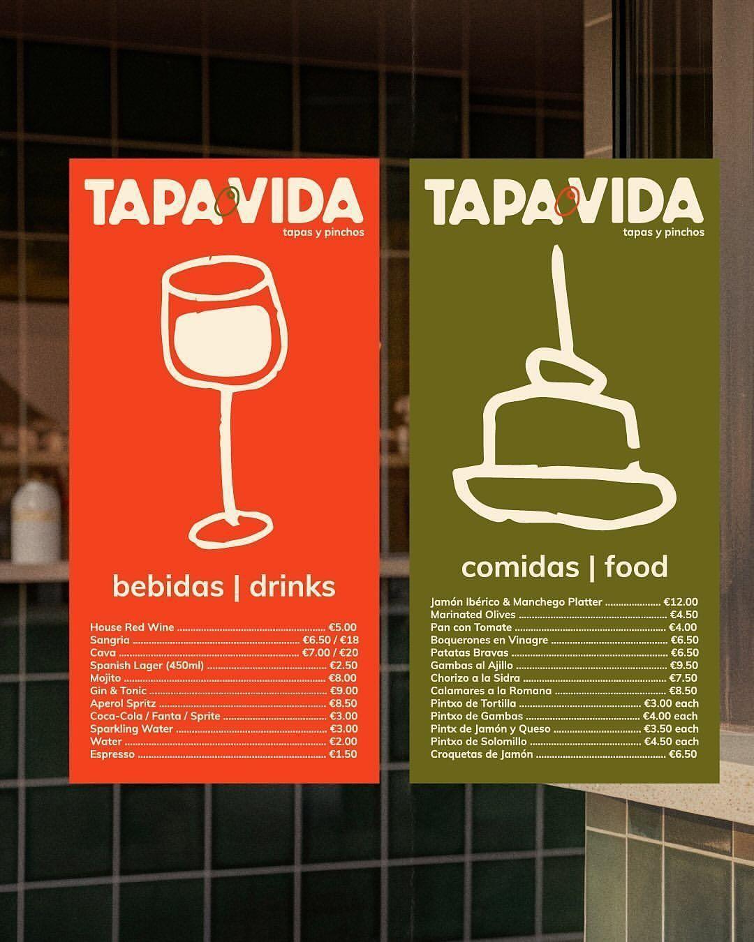
We structured Tapa Vida around one concept: sophisticated conviviality. Positioning: sharing as the signature, built on three pillars (authentic generosity, Mediterranean energy, contemporary elegance). The visual identity is warm and modern (sun-driven palette, expressive typography, subtle patterns inspired by reinterpreted azulejos) to create an immersive yet urban atmosphere. The spatial experience is lively (central counter, partially open kitchen, modular tables, warm evening lighting) to encourage exchange. Editorial strategy is embodied (products, chef gestures, sharing moments, lively nights) with a human, direct tone. The result: durable differentiation and a living place beyond a restaurant.
Galerie